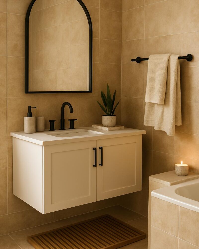
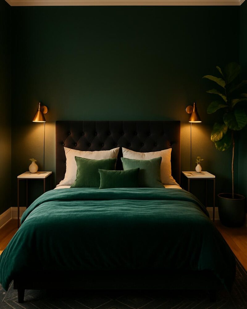
Get This Look
A well-chosen color combination can completely reshape the mood of a living room without a single drop of paint. This look pairs a deep terracotta-toned accent wall effect — achieved through textiles and decor — with cool sage and off-white neutrals to create a space that feels both grounded and airy. The result is a modern living room that layers color intentionally, not accidentally.
How to Recreate It
- Anchor the room with a large area rug in a warm terracotta, rust, or ochre tone to establish your primary accent color on the floor.
- Choose a sofa in off-white, cream, or light linen to keep the foundation neutral and let the color accents do the talking.
- Layer in sage green throw pillows alongside a terracotta or burnt-orange pillow for a two-tone contrast that feels curated, not matchy.
- Place a ceramic vase in a muted earthy tone on the coffee table with a small trailing plant or dried pampas grass for organic texture.
- Add a table lamp with a warm-toned shade to reinforce the terracotta palette while providing ambient lighting in the evening.
- Hang a piece of abstract wall art that pulls all three tones — terracotta, sage, and cream — together as a visual anchor above the sofa.
Styling Tips
- Follow the 60-30-10 rule: 60% neutral (cream/off-white furniture and walls), 30% warm accent (terracotta rug and pillows), 10% cool contrast (sage greenery and accents).
- Use natural materials like rattan, jute, or linen to keep the palette feeling warm and organic rather than flat or overly matchy.
- Group decor items on your coffee table in odd numbers — a vase, a candle, and a small tray read instantly more styled than a single object.
- Keep window treatments simple and sheer in a cream or warm white so they diffuse light without competing with your color scheme.
Budget Swaps
- Swap a full sofa reupholster for a cream slipcover — it’s a fraction of the cost and still reads as a clean neutral base.
- Use a terracotta-painted terracotta pot from a craft store instead of a designer ceramic vase for the same earthy effect under $10.
- Look for abstract art prints on Etsy in a digital download format — print at your local print shop for under $20 and frame with an IKEA frame.
- A jute rug from Amazon gives you the same warm-toned grounding as a high-end area rug at a third of the price.